Excel Scientific
Brand, Web & Package Design
Forget the stereotypes of tie-dye and cartoon leaves. Cannabis is evolving, and so are the brands that represent it. Stewart Farms is a company dedicated to crafting premium wellness products from the ground up. However, with a growing market and shifting perceptions, they needed a brand identity and website that reflected their commitment to quality, integrity, and holistic well-being.
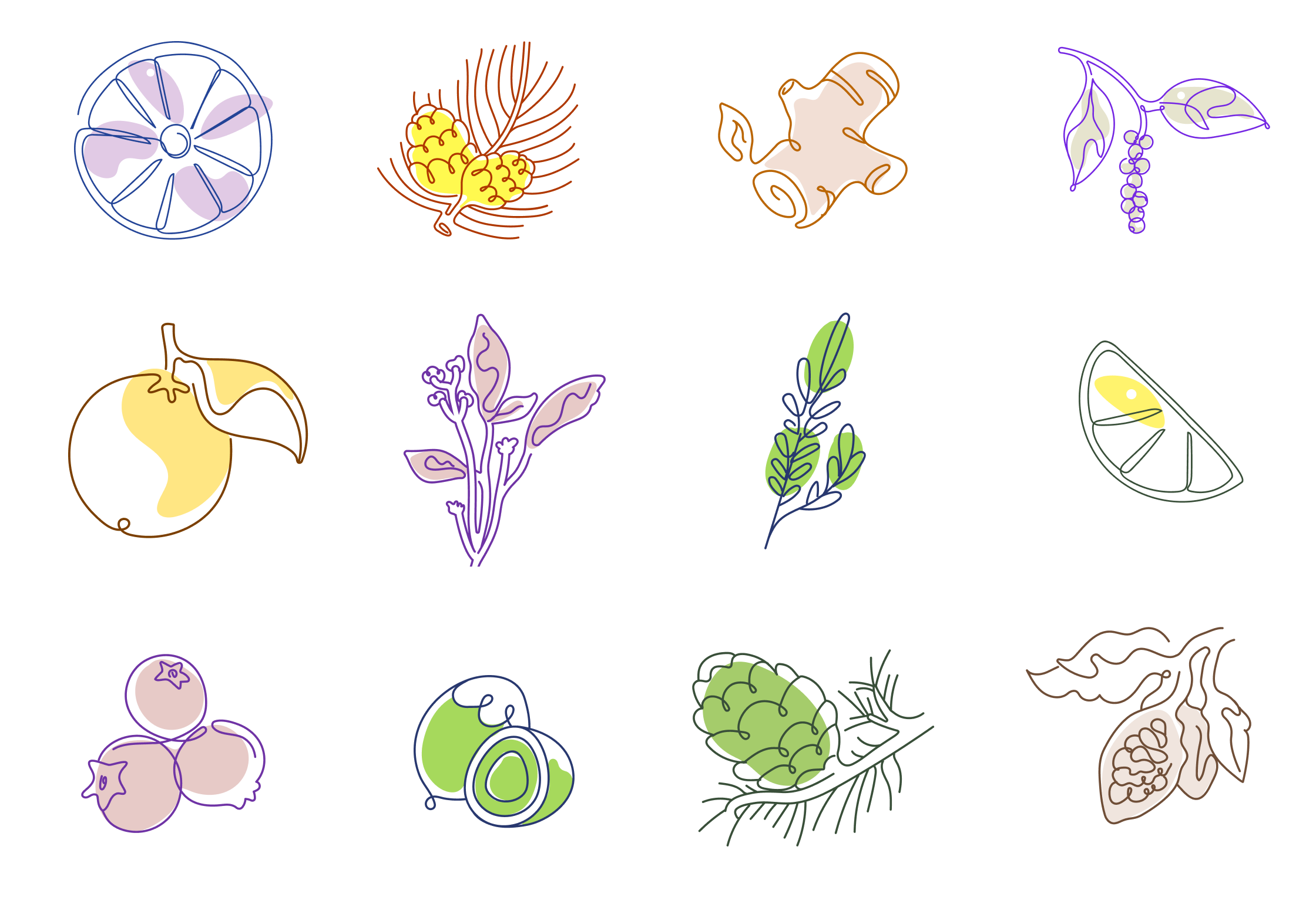
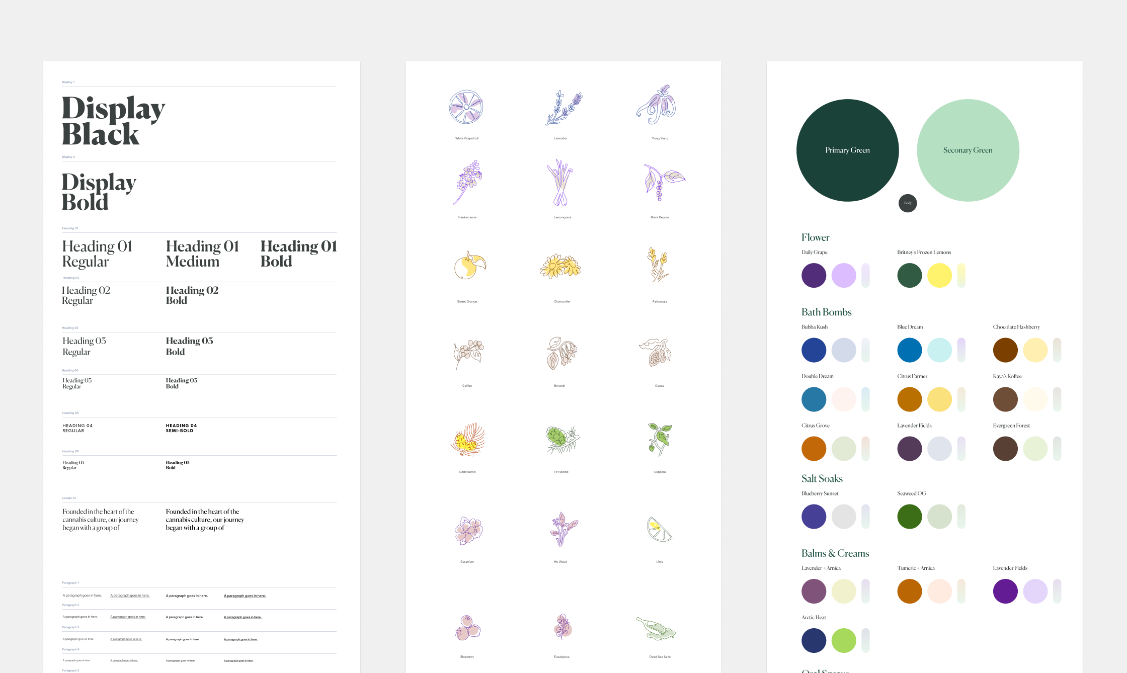
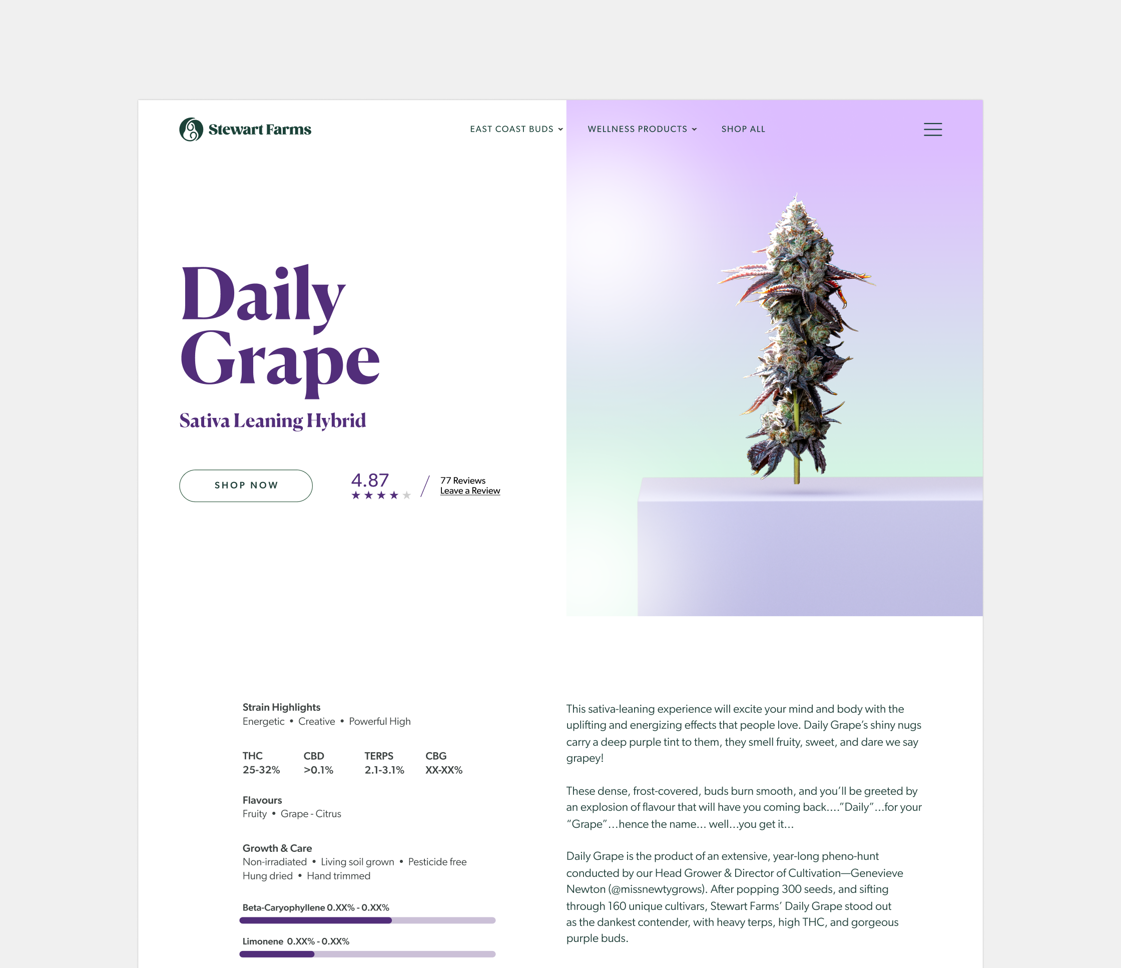
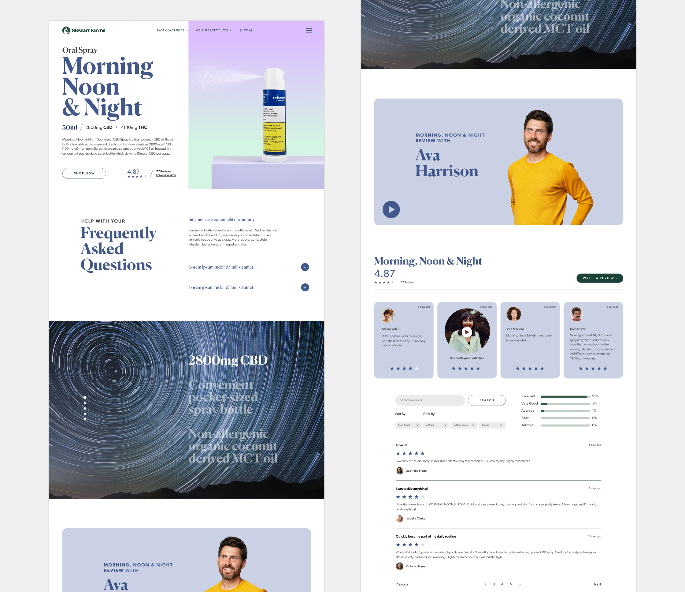
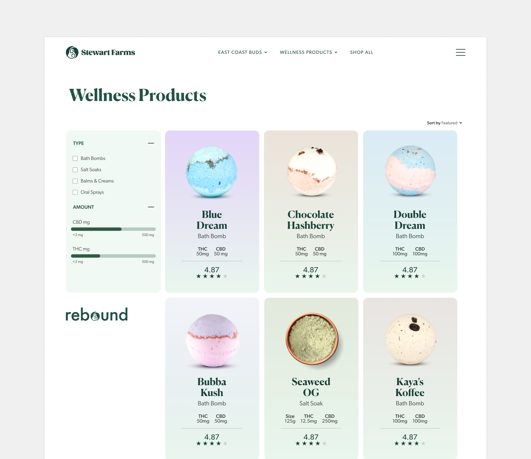
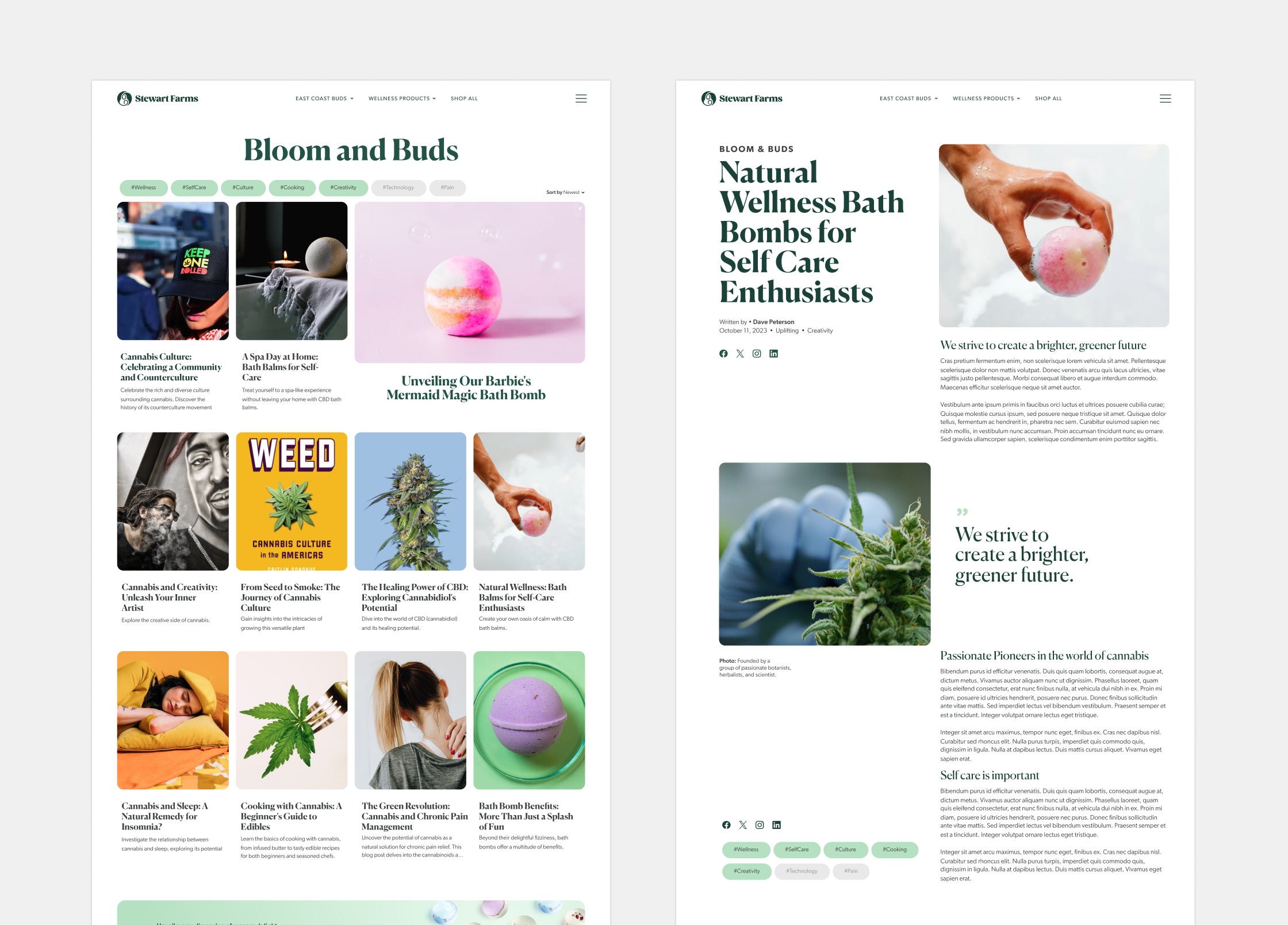
This wasn’t just a facelift; it was a complete cultivation. We began by digging deep into the fertile soil of Stewart Farms’ story, unearthing the values and purpose that define their brand. From there, we meticulously nurtured a new visual identity – a logo that embodies growth and balance, a colour palette that whispers of nature’s bounty, and typography that speaks with a voice both trusted and friendly.
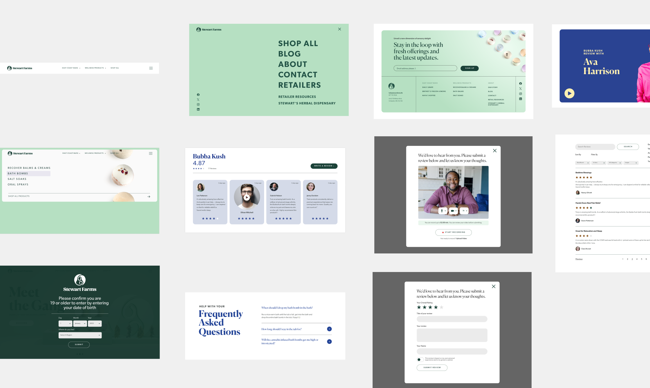
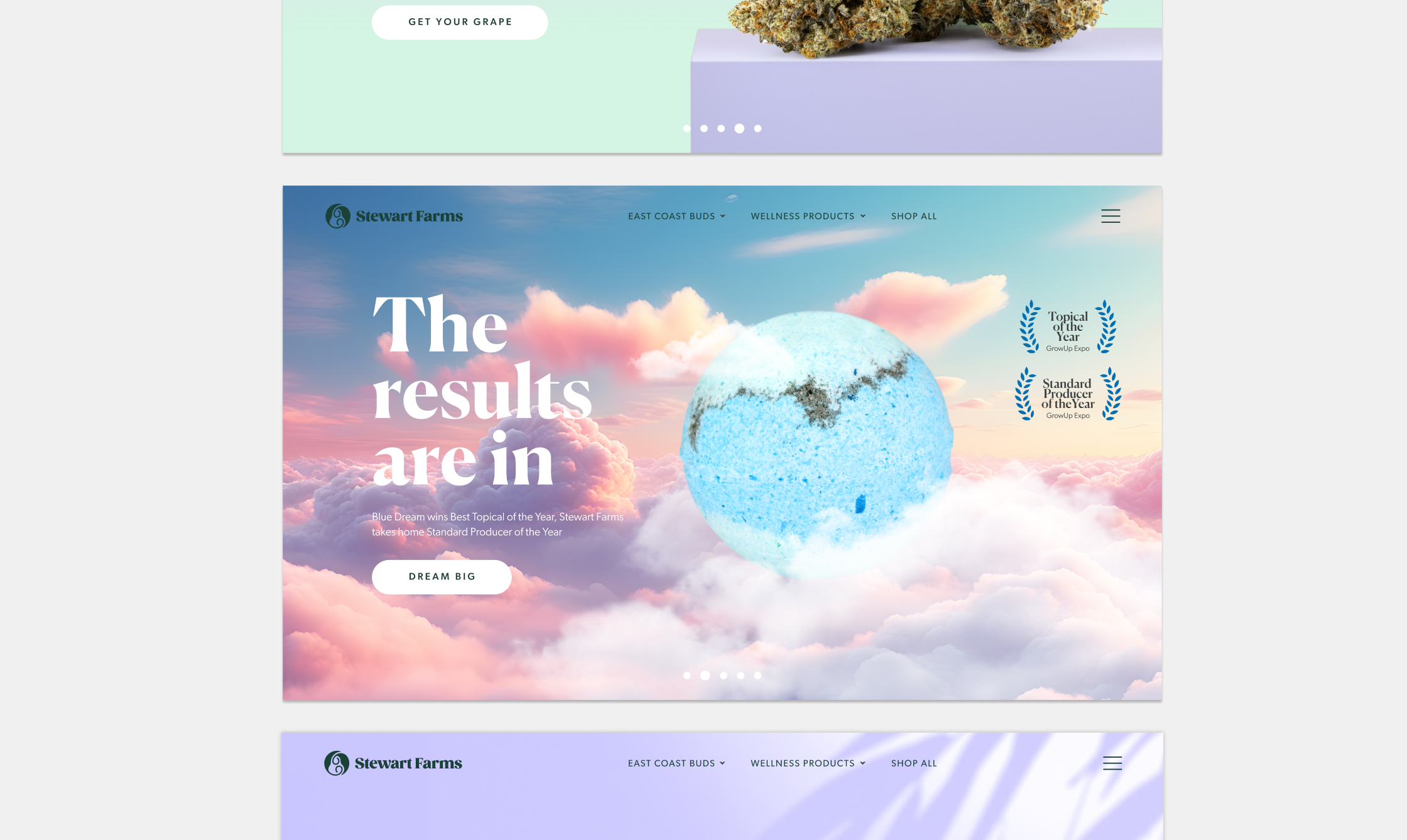
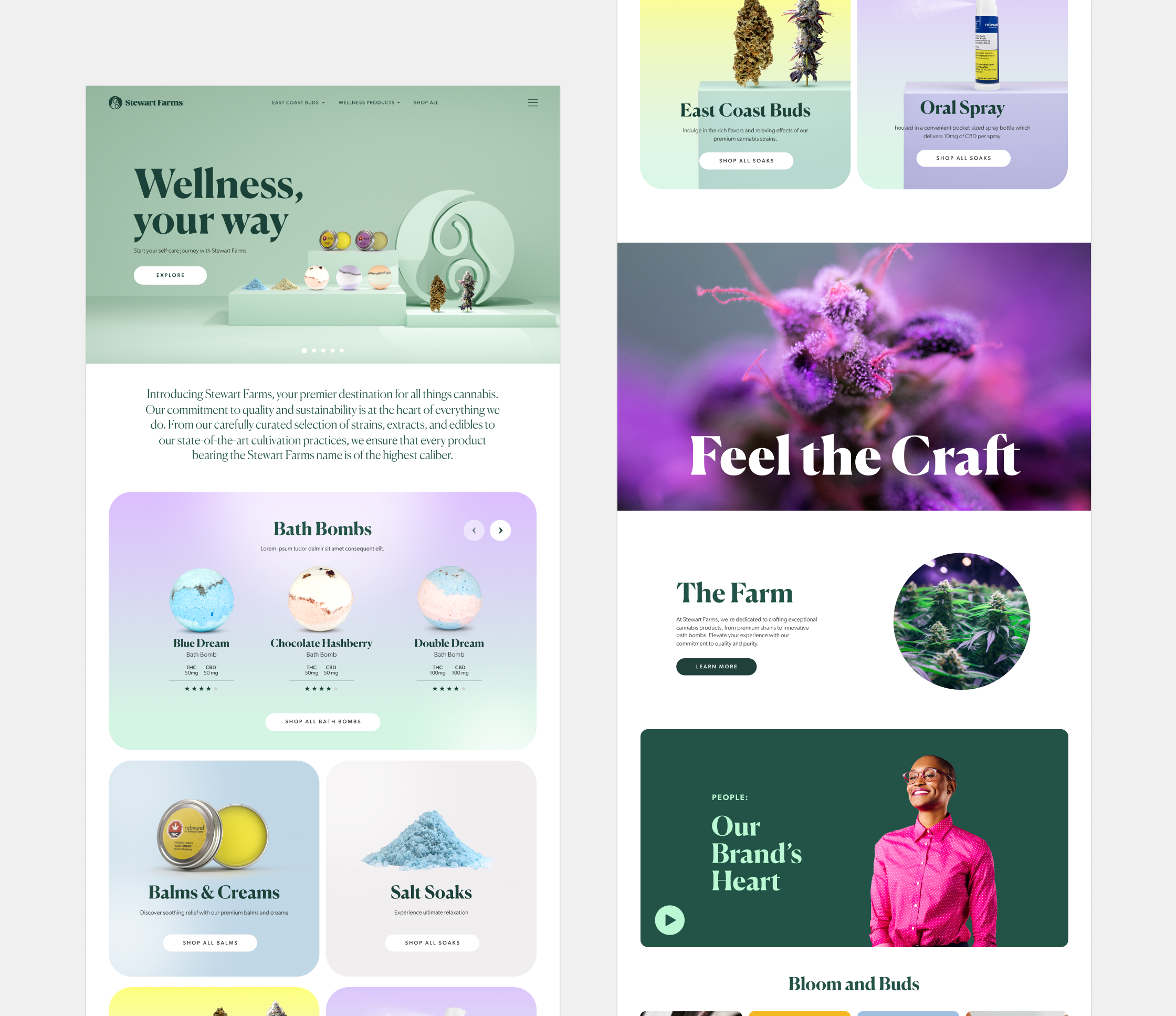
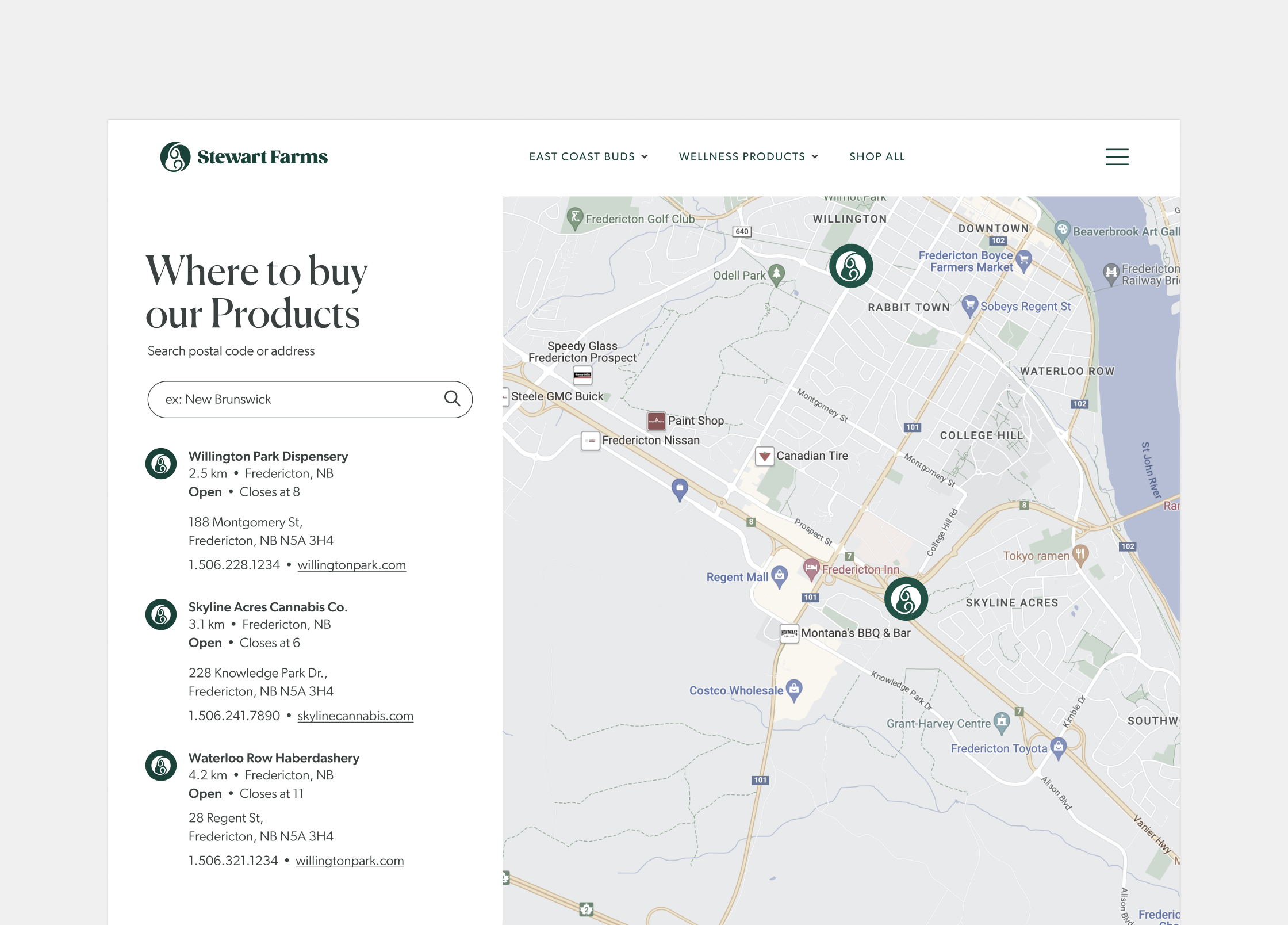
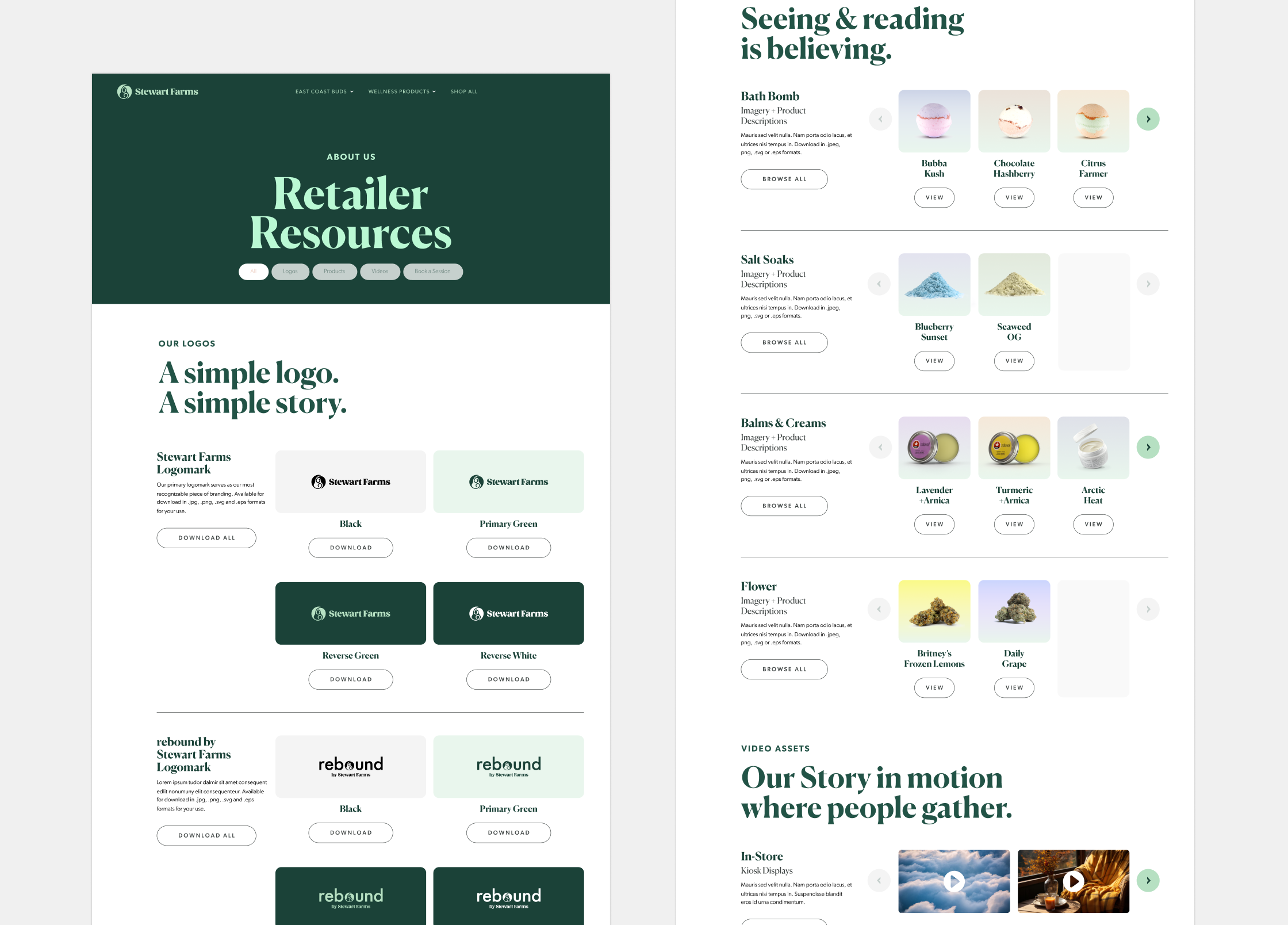
But a flourishing brand needs fertile ground to thrive. We transformed their website into a digital oasis, a space where education meets inspiration, and product exploration becomes a journey of self-discovery. With custom illustrations and captivating photography, we painted a vibrant picture of Stewart Farms’ world, inviting visitors to immerse themselves in the experience.
The result? A brand that transcends the typical cannabis cliches, standing tall as a beacon of quality and care. It’s a brand that whispers “wellness” in every element, from the carefully crafted packaging to the intuitive online experience. It’s Stewart Farms, redefined.
This is just a taste of what we grow at OrangeSprocket. Dive deeper into our portfolio and discover how we help brands blossom into their full potential, one carefully cultivated seed at a time.


Want to know more? Take a look at the way we’ve approach challenges and designed solutions for brands across the tech sector.