Brand Identity Design Refresh
Prospection, a leading provider of on-demand, patient-centric insights, came to us for a brand refresh. We knew we had a big challenge on our hands, but we were up for it.
The Prospection brand was dated and uninspired, and they needed a new look and feel that would better reflect their innovative and forward-thinking approach to business. A brand that would help them attract new and retain existing customers.
We started by conducting a comprehensive brand audit to understand Prospection’s unique value proposition and target audience. Once we had a deep understanding of their brand, we developed a new brand identity that was both modern and professional.
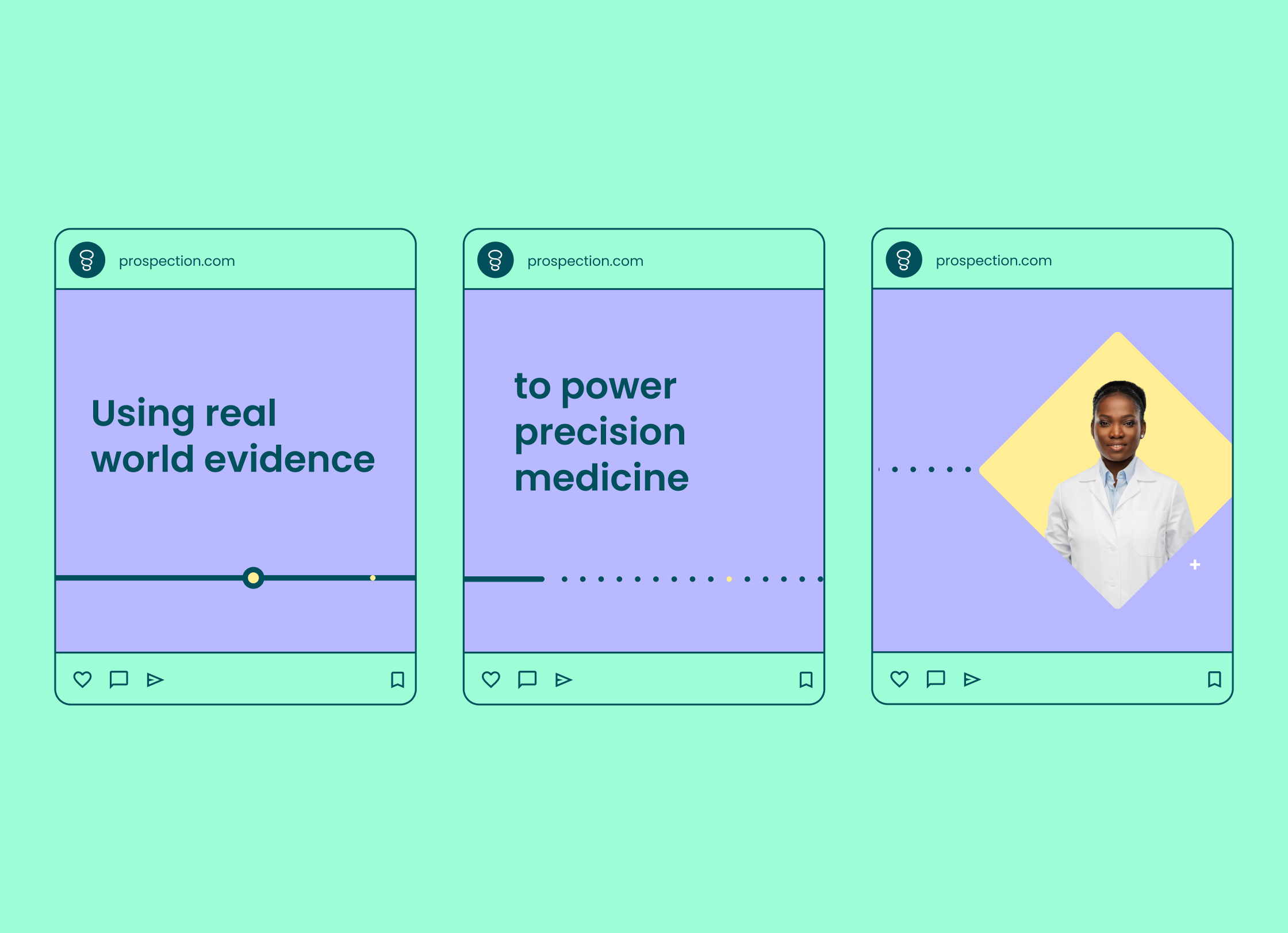
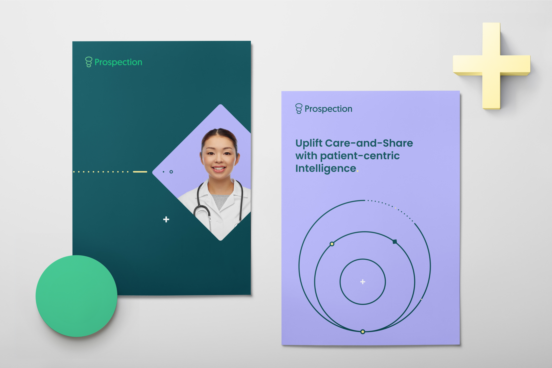
Their newly updated logo makes a subtle but confident statement with a more sleek and streamlined look. The colour palette is vibrant and inviting, and the overall design is both memorable and unique.
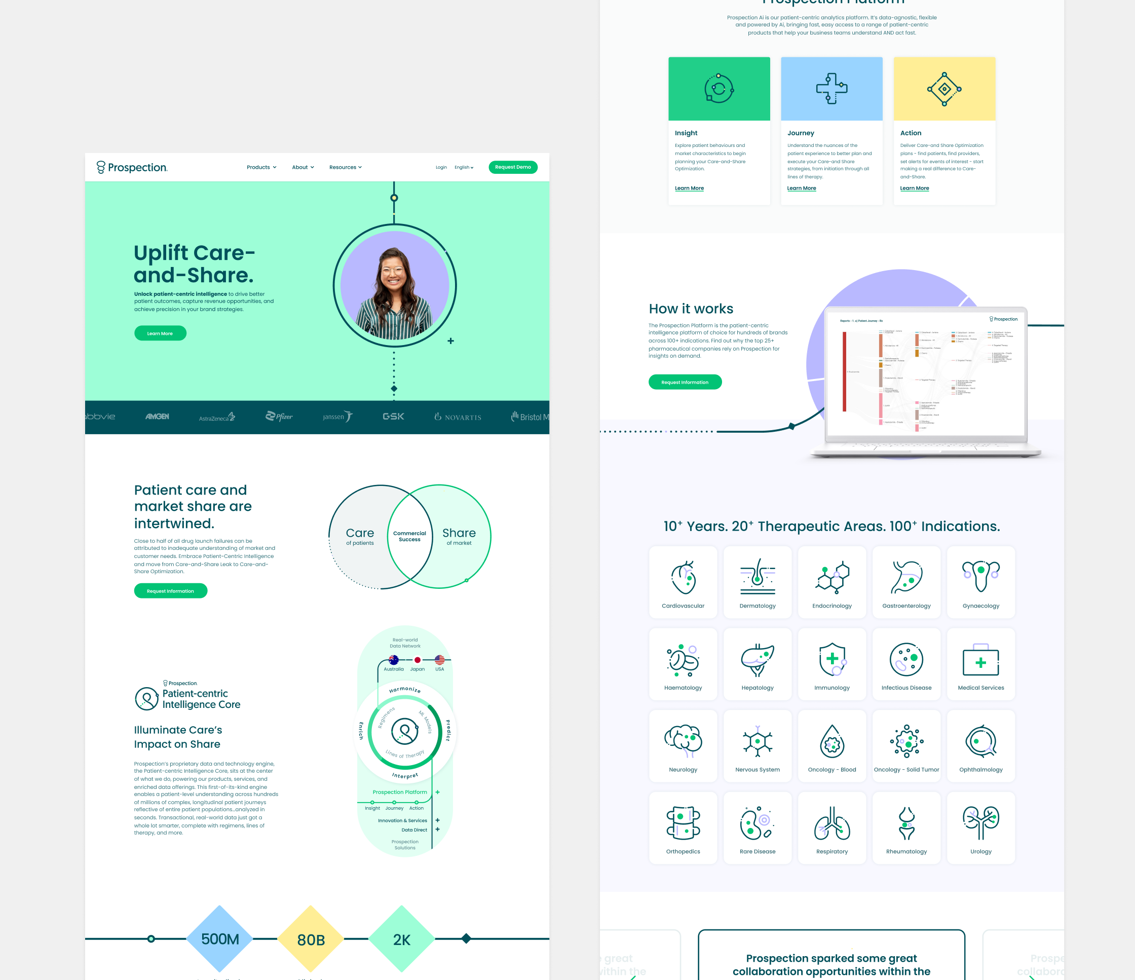
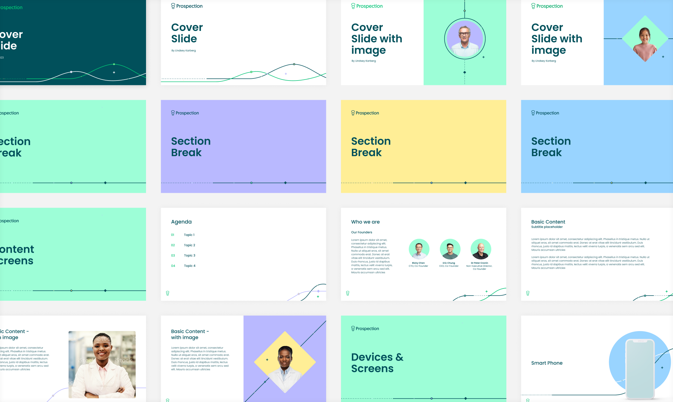
In addition to the logo design updates, we also created a new brand identity system, including foundation elements, typography, and illustration style. We also developed a new website design that is both responsive and user-friendly.
The results of our brand refresh for Prospection have been nothing short of spectacular. Their new brand has helped them to attract new customers, increase brand awareness, and position themselves as the leader in their industry.
Foundational Elements
Colour


Icons


Explore more work.
Want to know more? Take a look at the way we’ve approach challenges and designed solutions for brands across the tech sector.
This website uses cookies
I wish to opt out
